Buying a lipstick that looks elegant in the tube and then feels wrong on your face is one of the most common makeup frustrations. The color may seem pretty on its own, yet once it touches the lips, it can suddenly look orange, harsh, flat, or slightly off.
That usually isn't because the lipstick is bad. It's because the undertone isn't working with your skin.
Japanese makeup is especially helpful here because many formulas focus on refined color, wearable pigment, and finishes that are easy to control. If you enjoy subtle but polished beauty shopping, it helps to start with undertone first, then texture, then depth. If you're also exploring authentic Japanese beauty more broadly, this guide to what to buy in Japan cosmetics is a useful companion.
Introduction Finding Your Signature Shade
Undertone is the quiet color underneath your skin. It doesn't change much, even if your surface skin becomes lighter in winter or deeper in summer. Undertones are generally categorized as cool, warm, or neutral.
If you have a cool undertone, your skin usually has a pink, red, or bluish cast beneath the surface. Lip colors that lean blue or purple tend to look more balanced on you than shades with a strong orange or yellow pull.
A quick self-check helps.
- Vein test: Look at the veins on your wrist in natural light. If they appear blue or purple, that points to cool undertones.
- Jewelry test: If silver jewelry tends to look more natural and bright on your skin than yellow gold, that often suggests cool undertones.
- White fabric test: Hold plain white fabric or paper next to your face. If your skin looks clearer beside crisp white than cream, that can be another sign you lean cool.
Practical rule: If a lipstick looks “too peachy” on you again and again, your undertone may be cooler than you thought.
None of these tests has to be perfect on its own. What matters is the pattern. If two or three checks point in the same direction, you can shop with much more confidence.
What Are Cool Undertones and How to Find Yours
Cool undertones are usually described as pink, rosy, red, or bluish beneath the skin. Warm undertones lean golden, yellow, or peach. Neutral undertones sit somewhere in the middle and can borrow from both sides depending on the product.
That sounds abstract at first, but lipstick makes it easier to see. A red lipstick can still be either cool or warm. If the red has a blue or purple base, it tends to flatter cool skin. If the same red leans orange, coral, or brick, it usually harmonizes more easily with warm skin.
According to No7's lipstick shade guidance, matching lipstick to undertones is a long-standing beauty principle, and blue- or purple-based reds are consistently recommended for cool skin. That matters because it shows this isn't just a passing trend. It's a stable color-matching system used in beauty retail across skin depths.

Three ways to check your undertone
Start with your wrist veins in daylight. Blue or purple veins commonly point to a cool undertone. Greenish veins tend to suggest warmth.
Then check jewelry. Silver often looks crisp and harmonious on cool skin, while yellow gold tends to shine more naturally on warm skin. If both seem fine, you may be neutral.
The white paper test is useful when you feel stuck. Hold white paper near your bare face. Cool skin may look clearer, rosier, or more even beside pure white, while warm skin often comes alive beside cream or ivory.
What lipstick shades usually work
Once you know you're cool-toned, the most reliable color families become much easier to spot.
- Blue-based reds: Think cherry, classic crimson, and some wine reds.
- Cool pinks: Rose, soft pink, and fresh pink with a blue lean.
- Mauves: Muted pink-purple shades that look especially natural for everyday wear.
- Berries and plums: Raspberry, berry, and purple-red tones.
- Pink-browns: Nude shades with a rosy rather than caramel base.
These shades work because they echo the cooler tones already present in the skin instead of fighting them.
Where people often get confused
The hardest category is nude lipstick. Many “nudes” are warm beige, peach, or caramel. On cool undertones, those can make the face look dull or disconnected from the lip.
A better nude for cool undertones usually has some pink, mauve, or dusty rose in it.
If a nude lipstick looks slightly greyed, dusty, or rosy in the bullet, that can be a good sign for cool-toned skin.
Another common confusion is bright pink. Not every pink is flattering just because it's pink. A cool pink usually looks cleaner and bluer, while a warm pink leans coral or salmon.
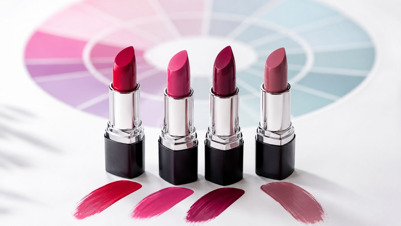
The Best Lipstick Color Families for Cool Tones
Some lipstick families are easier for cool undertones to wear. You don't need a huge collection. You need the right color direction.

Japanese cute makeup styles are a good reference if you like softer lip looks, blurred edges, and fresh color placement rather than heavy contrast.
Blue-based reds
This is the classic cool-toned lipstick family. Blue-based reds look vivid without turning orange, and they often make the whole face look more polished.
For day, think cherry red or a softened red stain. For evening, a deeper blue-red or wine red gives more drama while still feeling balanced.
Dusty roses and mauves
These are often the easiest everyday shades. They don't shout, but they do a lot of work. A dusty rose can make the lips look naturally enhanced, and mauve usually adds shape and sophistication without feeling severe.
This family is especially useful if you've tried beige nudes and found that they erase your mouth.
According to Maybelline's undertone guide, the most flattering lipstick families for cool undertones are blue- or purple-based reds, dusty roses, mauves, and pink-browns, because they avoid the yellow or orange bias that can make cool skin look sallow. The same guide notes that cool-toned lipsticks often contain blue pigment and may look more muted when swatched, which is a useful shopping clue.
Berries, plums, and pink-browns
Berry shades sit between pink and red, often with a touch of purple. They're excellent when you want something richer than rose but not as sharp as a bright true red.
Pink-browns are the practical nude category for cool undertones. They still feel neutral, but they carry enough rosy depth to stay flattering.
Here's a quick shopping view:
| Color family | What it tends to look like | When it works especially well |
|---|---|---|
| Blue-based red | Crisp, classic, bright | Formal looks, defined makeup |
| Dusty rose | Soft, muted, elegant | Everyday wear, office makeup |
| Mauve | Rosy purple, balanced | Easy neutral looks |
| Berry or plum | Rich, deeper, dimensional | Evening, cooler seasons |
| Pink-brown | Nude with a rosy base | Minimal makeup, polished casual looks |
A short visual guide can help if you want to compare undertone shifts in motion.
Why Japanese lipstick textures fit this so well
Japanese lip products often come in sheer, glossy, balm-like, and softly tinted formats. That's useful for cool undertones because a color that seems bold in the bullet can become very wearable when the formula goes on in a light veil.
You can also build intensity more carefully. A mauve tint, a berry balm, or a softened red gloss often gives more control than a dense opaque matte from the first swipe.
Flattering Lipstick Shades from Top Japanese Brands
You are standing at a makeup counter, testing two lipsticks that both look “rose” in the tube. One brightens your whole face. The other makes your skin look slightly tired. That difference usually comes from undertone and texture, and Japanese brands are especially good at making both easier to read on the lips.
They often offer softer pigment, clearer color direction, and finishes that let you build a shade gradually instead of committing to full intensity in one swipe. If you want a quick overview of brands known for those formulas, this guide to Japanese makeup brands is a helpful starting point.
Canmake for soft, easy cool tones
Canmake is a gentle entry point if bold lipstick usually feels intimidating. Many of its lip colors sit in the cool-friendly zone of rose, pink-red, berry, and mauve, and the formulas often have a light, fresh finish.
That matters because a sheer berry works like a watercolor wash. You still see the cool base, but the result stays airy rather than heavy. If warm shades like coral or apricot tend to look slightly orange on you, Canmake's rosier options are often much easier to wear.
Cezanne for practical everyday shades
Cezanne is useful for the person who wants a lipstick to look polished, calm, and easy to pair with daily makeup. The brand often does muted rose and pink-brown shades especially well.
These colors solve a common problem for cool undertones. A standard beige nude can drain definition from the face, while a rose-brown keeps the lips visible without looking overdone. If you wear simple liner, mascara, and neat base makeup, this type of shade usually fits beautifully.
Counter advice: Judge the color after it settles in one or two layers. Many Japanese lip formulas look stronger in the bullet than they do on the lips, and the real undertone shows up more clearly after a minute.
Kate for stronger contrast and cleaner definition
Kate suits cooler undertones that can handle more structure in the lip color. If your features already have some contrast, or you like a sharper finish to your makeup, its blue-reds, deeper roses, and wine tones can look striking in a very controlled way.
A useful way to compare the brands is this. Canmake often whispers. Kate speaks more clearly. Both can flatter cool undertones, but they create different moods.
Chifure for understated classic picks
Chifure is often the reliable choice for straightforward, wearable shades. Rose, mauve, and berry-leaning colors usually feel more natural here than peachy beige options.
This is the sort of lipstick many people keep in a handbag or desk drawer. The shades tend to be easy to reapply, easy to pair, and easy to trust.
Matching brand style to skin depth
Brand personality matters, but depth matters too. A color family can stay the same while the best version of it changes with your complexion.
- Fair cool skin: light rose, gentle mauve, and clear blue-based reds often look fresh and balanced.
- Medium cool skin: richer mauves, berry roses, and burgundy-leaning reds usually show up with enough depth.
- Deep cool skin: deeper berry, plum, and blue-red shades often keep their clarity better than pale cool pinks.
Texture also changes the result. A stronger berry in a translucent formula can look soft and lively, while a lighter dusty rose may need more pigment or a satin finish to stay visible on deeper skin. Japanese lip products are especially helpful here because many formulas let you adjust intensity in small steps.
That makes shopping less confusing. Instead of asking only, “Is this pink cool-toned?” ask, “Is this cool pink sheer, muted, glossy, or saturated?” Once you start reading lipstick that way, brand differences become much easier to spot.
Choosing the Right Finish and Intensity
Undertone tells you the color direction. Finish tells you how loud or soft that color will look once it's on your face.
A cool lipstick can still feel wrong if the finish is too flat, too glossy, too pale, or too intense for your features.

Finish changes the mood
Matte finishes make color look stronger and more defined. A matte berry or matte blue-red can look elegant, but it can also feel stricter. If you're unsure, start with satin.
Satin finishes are often the most balanced. They hold enough color to show undertone clearly, but they still reflect a little light and stay forgiving on lip texture.
Glossy or balm-like finishes are helpful when you like cool shades but don't want them to feel heavy. A cool rose gloss or berry balm often reads softer and fresher than the same shade in matte.
Match intensity to your skin depth
According to Mented's guidance on cool undertones, cool olive skin may suit dusty rose, medium cool skin is often flattered by burgundy reds, and dark cool skin can carry vibrant blue-based reds especially well. The main lesson is simple. Skin depth and undertone variation matter just as much as the cool category itself.
Here's a practical approach:
| Skin depth or variation | Usually easier choices | Common mistake |
|---|---|---|
| Fair cool | Rose, soft mauve, clear cool pink | Choosing beige nude that turns flat |
| Medium cool | Burgundy red, fuller mauve, berry | Picking a neon cool pink that feels too bright |
| Deep cool | Blue-red, plum, rich berry | Choosing a pale cool shade that looks chalky |
| Cool olive | Dusty rose, muted mauve | Choosing a cool shade that's too icy |
A useful prep step is lip care. If your lips are dry, cool matte colors can cling unevenly and look patchy. Using a conditioning base first helps. A water-based lip balm guide is helpful if you want something lighter before lipstick.
Soft texture plus the right undertone usually looks better than forcing the boldest shade in the room.
Keep the rest of the makeup in balance
Cool lipstick tends to look best with blush that sits in the same family. Rose, cool pink, and berry blush usually pair more smoothly than peach or orange blush.
If your lipstick is strong, let the cheek color stay soft. If your lip is a sheer cool pink, you can add a little more cheek color without the face feeling overdone.
Application Tips and Makeup Pairing
The right shade still needs the right placement. Good application makes cool tones look intentional instead of accidental.
Start with smooth lips. A thin layer of balm, a few minutes to settle, and a gentle blot usually gives the best base. Too much balm can make lipstick slide, so keep it light.
Simple ways to make cool lipstick look better
- Use a lip liner close to the lipstick tone: This helps define the mouth, especially with blue-reds and berries.
- Apply in thin layers: One light layer often looks more refined than one thick swipe.
- Blot and reapply: This builds stain and improves hold without making the finish heavy.
- Blur the edge for daytime: A softened outline makes berry and mauve shades feel more casual.
Pairing with blush and eye makeup
Cool lipstick usually pairs best with blush in rose, pink, or soft berry tones. Peach blush can compete with the lip and make the face feel split into warm and cool sections.
For eyes, taupe, soft grey-brown, charcoal, muted pink-beige, and plum accents usually sit well with cool-toned lips. If you want to coordinate the whole look, makeup ideas for Asian eyes can help with liner, shadow placement, and balance.
A polished cool-toned look often comes from harmony, not from adding more products.
One simple formula works well: cool lip, cool blush, neutral eye. That combination stays fresh, elegant, and easy to wear in daily life.
Embrace Your Cool Tones with Confidence
Once you understand undertone, lipstick shopping becomes much less random. A cool undertone usually responds best to blue-based reds, dusty roses, mauves, berries, and pink-browns. Those shades tend to look balanced because they don't pull the face toward yellow or orange.
Finish matters too. Sheer and satin formulas are often the easiest place to start, especially if you're testing stronger cool shades for the first time. Depth matters as well, so it helps to adjust the intensity of the color to your skin tone rather than relying on one universal recommendation.
Japanese beauty brands make this process easier because many of their lip products are refined, wearable, and thoughtfully toned. If you enjoy lip color that feels polished rather than heavy, exploring Japanese lipstick shades for cool undertones can be a very satisfying next step.
If you'd like to explore authentic Japanese lip products and beauty brands in one place, Buy Me Japan offers a convenient way to shop Japanese cosmetics shipped directly from Japan.
Share:
What to Buy in Japan Cosmetics: 2026 J-Beauty Guide
Makeup Brush Cleaning: A Japanese Guide to Perfect Tools