


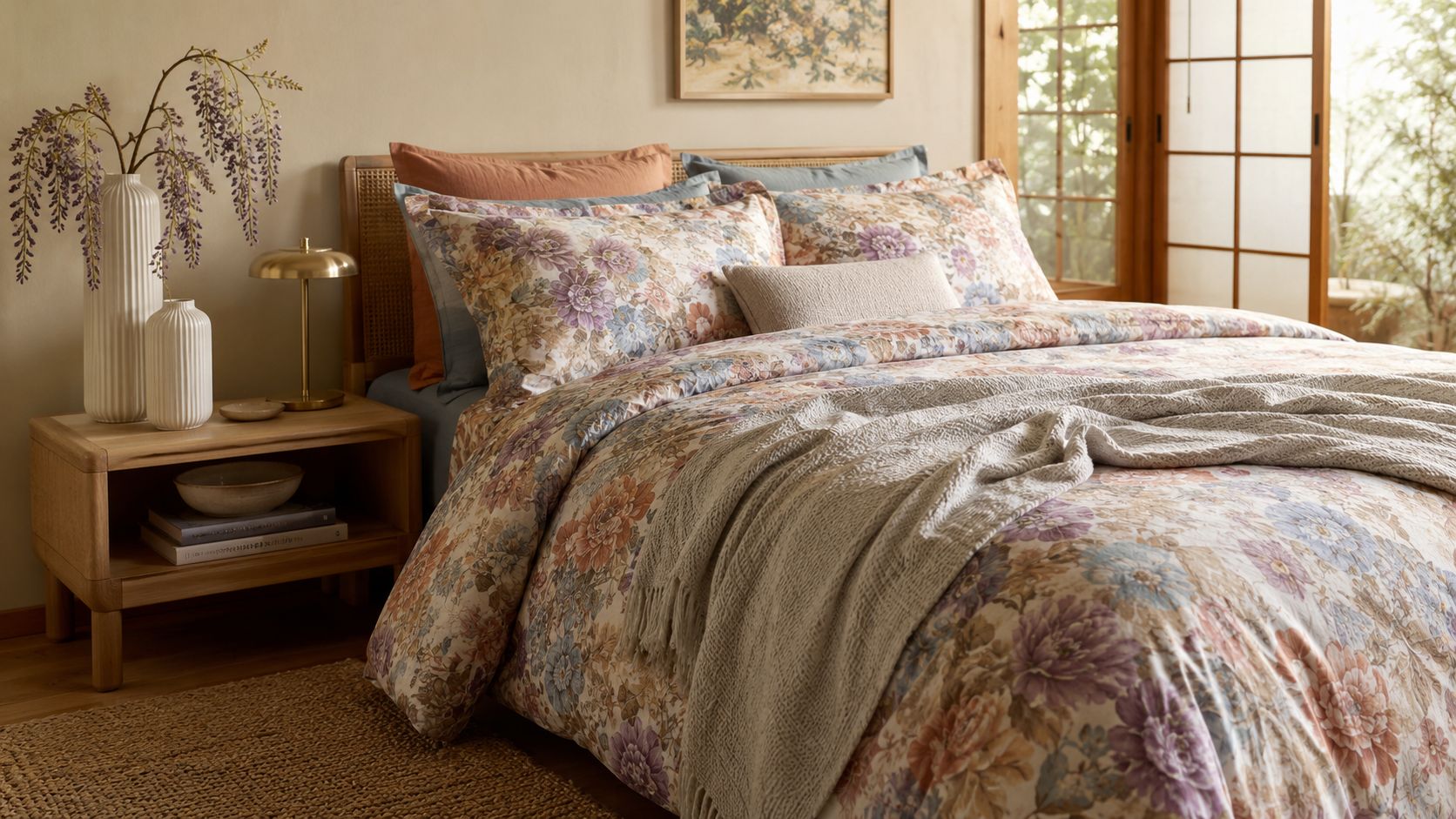
You're scrolling through bedding listings, and every floral print starts to blur together. Some look sweet but too busy, some look muted but flat, and some feel retro in a way that's hard to pin down. The difference usually comes down to scale, color, and fabric, not just whether the print has flowers in it.
Retro floral bedding has stayed recognizable because it sits at the intersection of design history and everyday use. Floral interiors became especially prominent in the 17th and 18th centuries during the Baroque and Rococo periods, then moved into wider circulation in the 19th century as printing technology made floral textiles more affordable and accessible Thomasville at Home. By the late 1980s, patterned sheets already made up about 75% of the U.S. $1.2 billion wholesale sheet market, and at least 20% were being bought for decorative purposes Thomasville at Home. That long shift from ornament to mass-market home textile explains why the look still feels familiar.
Understanding the Retro Floral Aesthetic
Retro floral bedding reads as retro when it feels intentionally time-stamped, rather than merely garden-themed. The strongest cues are scale, palette, and the mood of the motif itself. Small, scattered florals can feel more 1970s cottage, while larger blooms and wider spacing often point to mid-century or late-60s styling.
What makes a floral print feel retro
Color does a lot of the work. A strong retro set usually avoids hard primary colors and instead uses sun-bleached pastels, earthy tones, and faded hues like soft mauve, washed-out blue, and gentle gray, which aligns with vintage floral guidance that favors muted, weathered color families LuxLoomLair. That softening matters because it keeps the print from looking cartoonish or overly new.
Practical rule: if the print feels bright enough to dominate the room before the bedding is even made, it probably reads more novelty than retro.
Era signature matters too. The strongest retro collections often borrow from 1970s, 1980s, and 1990s floral styling, which helped turn the motif from formal tradition into a mainstream bedroom choice French Country Cottage. I usually tell shoppers to look for motifs that feel rooted in lived-in interiors, not polished graphic design.
The Japanese connection is useful here as well. Motifs such as chrysanthemums, peonies, and wisteria carry strong heritage associations in Japanese visual culture, and they work especially well when the color palette stays softened rather than saturated. That is one reason floral bedding can feel both nostalgic and refined in homes that value restraint, especially when you compare it with the cleaner lines often discussed in Japanese home decorating ideas.
For a broader decorating reference, the country-floral approach in designer-inspired country floral bedding shows how a floral print can stay classic without becoming stiff. It is a useful comparison point when you are deciding whether a set feels vintage, modern, or just busy.
A good room starts with a good read on the print. If the scale, tone, and motif history all point in the same direction, you are probably looking at true retro floral bedding rather than a generic botanical set.

Choosing the Right Fabric and Print Quality
A well-made retro floral set should hold its scale across the actual duvet, not just look appealing in a single product photo. The fabric matters as much as the print, because weave, fiber, and surface finish all change how the pattern sits on the bed. I've seen attractive florals lose their appeal quickly when the cloth was too shiny, too thin, or too stiff for the motif.
Start with fiber, then judge the finish
The three constructions you'll see most often are 100% polyester microfiber, cotton-blend or slub fabrics, and 100% cotton satin or sateen. Microfiber usually feels soft right away and is often positioned at a lower cost point, but it can trap heat more easily than breathable cotton. Cotton sateen gives the floral print a smoother surface and a gentle sheen, while cotton with a crisper weave feels cleaner and lighter against the skin.
A practical buying filter is simple.
- Microfiber: choose it if you want softness, easy care, and a smoother feel without paying for premium cotton.
- Cotton sateen or satin: choose it if you want a richer drape and a more refined floral presentation.
- Cotton-blend or slub: choose it if you want texture and a more casual vintage feel.
Thread count gets overused in bedding marketing. Listings for retro floral bedding can show thread counts anywhere from 0 to 400, but that number alone doesn't tell you how the set sleeps or how long the print will hold up Strohscheuerpflug. Fiber type, weave, fill composition, and whether the print sits on the face fabric or a reversible layer give you a better read on quality.
Practical rule: if a listing leans hard on thread count but won't clearly name the fiber and weave, I treat it as a weak signal.
Sizing is the other hidden quality issue. Standard listings often use dimensions such as 68x88 in twin, 88x88 in queen, and 104x88 in king, with shams in 16x26 in standard or 20x36 in king Gemmcdowell. That means repeat placement has to leave enough quiet space for larger formats so blooms don't get sliced at edges or closures.
The repeat itself deserves a close look. Dense blossoms can feel lively on a throw pillow, then turn cluttered across a full duvet if the motif is too small or the spacing too tight. Larger floral repeats usually read better on bigger beds, while tighter repeats can work if the palette stays calm and the weave has enough texture to keep the surface from looking flat. I pay attention to whether the print has room to breathe, because that is where the set starts to feel intentional instead of busy.
If you want a wider comparison point, the way top Japanese clothing brands talk about fabric consistency is useful. The same principle applies here, clear material labeling and predictable construction usually matter more than a polished product photo.
Coordinating Colors and Room Elements
A retro floral duvet can carry a room, but only if the surrounding pieces know their role. If the wall color, rug, pillows, and lamps all compete with the bedding, the eye never settles on the print. I usually start by choosing one quiet base, then let the bedding supply the movement and the smaller accessories echo a single note from it.
Use the room like a frame
A dominant neutral gives the floral room to breathe, a secondary tone pulled from the bedding ties the palette together, and one accent shade from the smallest details keeps the setup from feeling flat. That might be a warm ivory wall, a muted blush cushion, and a smoked-glass lamp base. The point is to keep the pattern readable, not to match every petal.
The room style can push the set in different directions. A calmer, pared-back room supports muted, sun-bleached palettes, while a room with more texture can handle richer earth tones and stronger contrast. Both approaches work, but only if the rest of the room commits to the same level of visual energy.
A few combinations hold up in real rooms.
- Solid-colored pillows: these keep the floral bedding in front.
- Natural wood or brushed metal hardware: these echo the period without adding more pattern.
- One grounding rug: pick a rug that repeats a single tone from the print instead of introducing another color family.
Overlapping prints too close to the bed usually create noise. Stripe, plaid, and floral can work together only when one of them stays quiet, and that restraint is harder to pull off than it looks. I have seen better results from one strong floral set paired with solids than from a room that tries to coordinate everything at once.
For a useful example of how restrained color families stay coherent, the palette logic in lipstick shades for cool undertones translates well to interiors. Cool, muted tones tend to sit beside retro florals without fighting them.

Layering and Accessorizing for a Styled Look
Layering is where retro floral bedding starts to feel lived-in rather than newly unboxed. The print brings the character, but the surrounding textures decide whether the bed reads as styled or just crowded. A floral set can hold a room on its own, so every added piece needs a clear job.
Build texture without losing the print
Shams, quilts, and throws should support the floral, not bury it. A single folded quilt at the foot of the bed adds structure, while one or two pillows in linen, cotton, or knit bring contrast without competing for attention. If the bedding already carries a dense print, leave some negative space visible so the pattern can read from across the room.
The way a set is packaged matters too. In retail, retro floral collections often arrive as coordinated multi-piece sets, sometimes with reversible construction or matching sheets and shams that make the bed feel planned instead of pieced together Gemmcdowell. That coordination helps, but it does not mean every included piece needs to be on display at once.
A restrained sequence usually looks best.
- Base layer: keep the fitted sheet and duvet visually quiet if the floral print is strong.
- Middle layer: add one quilt or coverlet for texture.
- Top layer: use one pair of statement pillows, not a stack of small cushions.
The room accessories should match the bedding's era without fighting the print. Brass lamps, ceramic vases, and warm wood tones sit naturally beside retro florals, and they do the work of finishing the room without adding more visual noise. A small tray with tea or a modest snack can also reinforce the relaxed mood, which is why a simple treat like Best Choice Eisei Boro Small Round Cookies 70g can fit into the scene without pulling focus.
Practical rule: if you need to explain every object in the bed arrangement, there are too many objects in the bed arrangement.
For a broader lifestyle cue, the edit at cool gifts from Japan fits the same comfort-led approach. Fewer objects, better chosen.
Caring for Retro Floral Bedding Long-Term
A floral set stays attractive only when the care routine is steady and low-stress. The print usually does not fail in one moment. It fades in stages, first at the seams, then along the fold lines, then in any area that gets scrubbed too hard in the wash. That is why maintenance matters as much as the original buy.
The first protection starts before the machine runs.
Turn the bedding inside out so the printed face takes less friction. Use the gentlest water temperature that still cleans the set well, especially if the palette depends on faded mauves, washed blues, or gray tones. High heat and rough cycles are what make a retro print look tired long before the fabric itself wears out.
Drying needs the same care. Line drying or low-heat drying is usually the safest way to keep shape and reduce shrink risk, while over-drying tends to flatten the hand-feel and makes wrinkles harder to smooth out later. Cotton sateen needs particular attention, since fabric softener buildup can leave the surface looking dull over time.
A few habits extend the life of the print in ways that show up quickly in use.
- Wash similar weights together: this limits abrasion from zippers and heavier items.
- Store folded or rolled, not crushed: permanent creasing shows up fast on floral faces.
- Rotate sets seasonally: each set gets recovery time between uses.
Reading wear early makes a bigger difference than trying to fix it later. Look for fading at the fold line, loss of contrast in the smallest motifs, and surface dullness where the floral should still look crisp. Those are the signs that the routine needs to change before the set starts to look flat.
For shoppers comparing care labels and fabric naming, UK home textile essentials is a useful reference point. The same attention to weave, finish, and labeling helps here too. If a listing also fits a wider aesthetic of well-made household goods, browsing products in Japan can help connect bedding choices with the rest of the room without drifting away from material quality.
Where to Buy Authentic Retro Floral Bedding
Authentic retro floral bedding is easier to identify when a listing tells the truth about the cloth. The best product pages clearly state fabric composition, weave type, and how the print is finished. If the description is vague, the bedding usually is too. That's especially important when you're comparing vintage-inspired pieces against true retro styling.
Japanese-made textiles often stand out for weave precision and dye consistency, which matters when a floral repeat has to stay visually aligned across a duvet face. When you shop, look at repeat alignment, color depth, and whether the hand-feel sounds crisp, smooth, or soft in the product copy. Those details help separate a careful textile from a fast imitation.
If you want a broader textile reference point, the guidance in UK home textile essentials is useful for understanding how fabric naming and home-linen standards affect buying confidence. The same discipline applies here. A shopper who can read a bedding label can usually avoid the worst surprises.
For Japan-focused home and lifestyle browsing, products in Japan can help connect bedding taste to a wider aesthetic world of clean, well-made goods. That matters because retro floral bedding tends to work best in rooms where the rest of the decor also respects material honesty and visual restraint.
Use this quick checklist before buying:
- Check the fiber and weave first.
- Confirm how the print is applied.
- Review the return policy and certifications.
- Look at photos of the full size, not just a cropped close-up.
Choose the set that fits both your sleep habits and your room, not just the print you liked in the thumbnail.
If you're ready to build a bedroom around a floral print that looks good in real life, start with a bedding set that tells you exactly what it's made from and how it's finished. Visit Buy Me Japan to browse Japanese home and lifestyle products with the kind of product detail that makes smarter bedding choices easier.



共有する:
Seasoned Soy Sauce: Guide to Uses & Best Brands
Whitening Face Mask Guide: Ingredients, Types & Picks